The logo, a visual representation of a product, company, organisation, or brand. Some logos have an obvious connection with what they stand for. Shield icons, for example, are often chosen by security companies. Others stick out because of their appealing looks. We wanted to have both!
MediaVerse combines so many different aspects that are all equally important to the project consortium: on the consumer side co-creation, accessibility, interactive experiences, on the creator side automatic annotations, content moderation, copyright management, on the technical side the development of multiple nodes to work together, and many other innovations. Thus, we envisaged the logo to highlight the project’s variety and that many components together form the complete picture. Consequently, one core aspect that we wanted to show was this variety of angles.
Another focus of MediaVerse lies on innovation and immersion. The project aims to create novel ways of connecting people in a virtual space who cannot be together in a physical setting. A completely flat icon did not seem appropriate to visualise the spatial component of the MediaVerse approach.
At the end of a long and creative process in which we played with digital and analogue models in 2D and 3D we are now happy to present the MediaVerse logo:
The Avenue to a new logo
The path was long and winding. The designer and the project team kicked off the design process by generally discussing the character of the logo. Starting with traditional photoshop experiments around the letters M and V, some of the ideas we came up with seemed nice but still “flat” – literally but also in terms of charisma. Thus, the process consisted of multiple feedback loops and included not only digital but also analogue and experimental prototyping as described by the project’s Communication Task leader Nico in the box below.
A personal journey in the world of paper prototyping
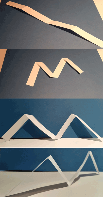
Experiment 1: White Stripes
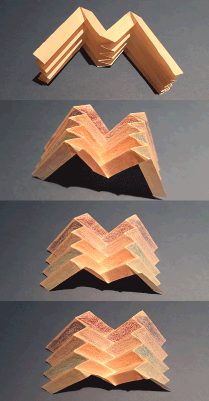
While the “logo-team” was discussing the looks of a potential logo, I took a sheet of paper and scissors and cut off a white stripe, folded it here and there and soon held a “three-dimensional M” in my hand. I was fascinated: even when you moved around it, it still appeared as a capital M.
Experiment 2: Origami
As my daughter (16) is a well-trained fan of Origami, I asked her, if she wanted to join the creative logo creation process. She agreed and started with some initial research, looked for further inspiration on the web and in no time came up with a beautiful version that showed a capital M and a capital V, and added some extra depth.
Based on her prototype I experimented a little with some colours to underline the variety of topics the project targets. The many different views – from the top, from the side, from the front – even added more inspiration.
Experiment 3: Old School Font
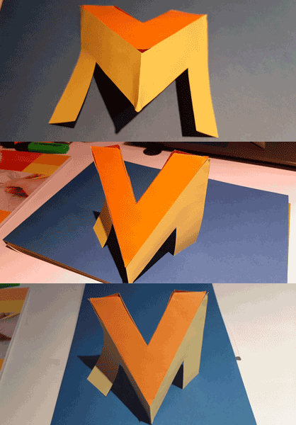
Being heavily influenced by the pop culture of the 1980s, including graffiti street art, I had yet another idea: when I was in my teens I used to draw heavy block letters in 3D style, so I was scanning the web for old school graffiti fonts and found something very three-dimensional that I tried to rebuild with cardboard. This proved rather difficult as the drawing seemed to ignore the laws of physics. It worked quite well in 2D on paper but was hard to get into a solid 3D form that would make sense.
This anecdote shows: working on the logo was fun, enlightening, and an overall challenging but fulfilling process to everyone involved – and it was great team work! When the graphic designer saw the paper prototypes, she burst into laughter because she had never seen this kind of involvement in a project management team before. She really loved the idea and found inspiration in it. During this very engaging design process numerous logos were created that contained different aspects described in this article, including the above paper prototypes.

Getting old is natural, growing up is optional
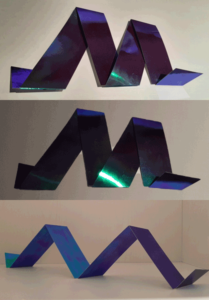
Eventually, the project consortium agreed on the logo that is now being used. But the design process is not done yet: some partners are investigating ideas how to use the spatial aspect of the logo for a demo of the project’s 3D and VR technologies. Yet again, while the experts are working on a digital version, I, Nico (also acting in a multi-dimensional way, namely as the main author of this article and enthusiastic DIY designer at the same time), took the liberty to create just another fancy cardboard prototype of the final logo.
Stay tuned!
